Ready for your next lesson?
You may remember that we talked about making a landing page in our last lesson. Well, that topic deserves some more details.
“Lead capture pages” or landing pages are one of the biggest sources of new leads for a business. Since the stakes are so high, you have to put serious effort into your page. Not to worry, though, that’s what we’ll talk about today.
The Structure of a Landing Page
Before you even decide what your landing page will be about, you should have a page template in mind. You’ll be a lot more efficient if you know from the get-go what topics to cover and how much space you have.
Here’s a great example from Neil Patel:
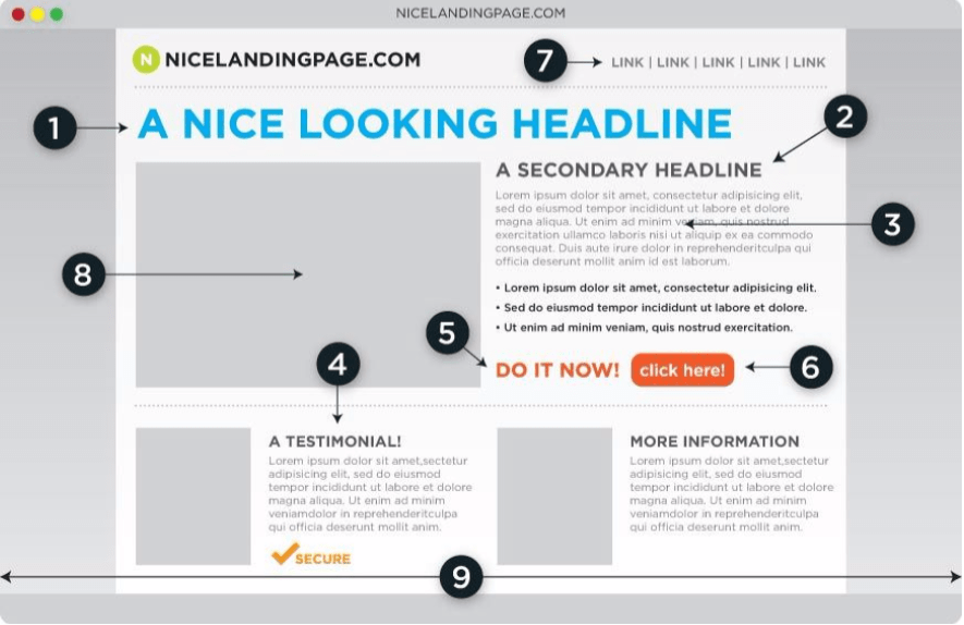
Seems easy enough, right? Let’s go over each point of interest here:
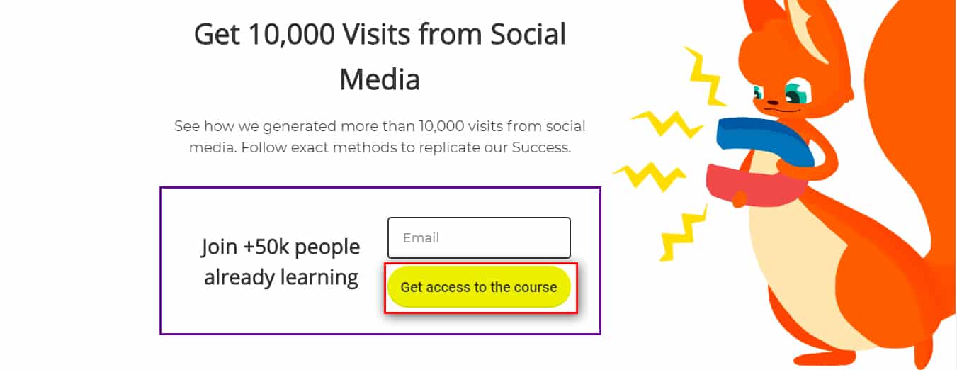
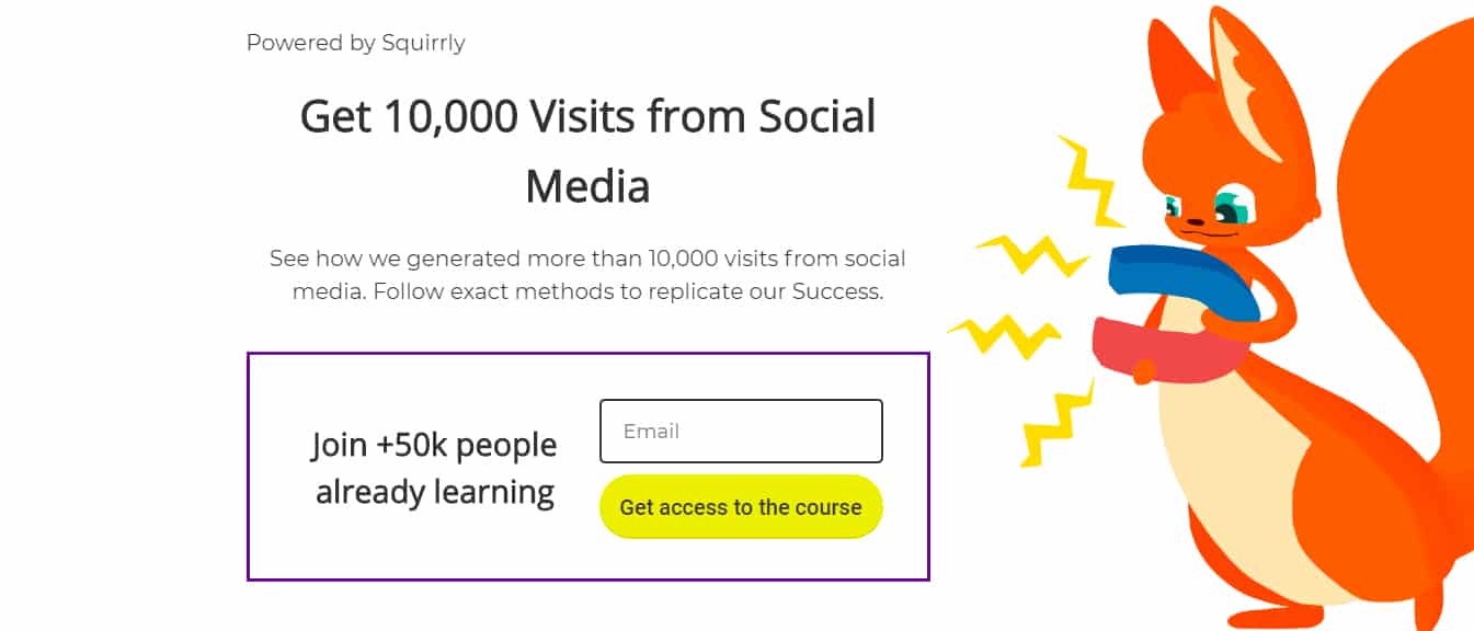
1) The Headline. You need something eye-catching. The reader should immediately understand the page’s topic. Think something along the lines of “Get 10,000 visits this month from Social Media.”

2) The Secondary Headline. Now that you’ve got the reader interested, start giving details. Let’s follow the example. This would fit nicely: ” Join our exclusive list and you’ll receive these tutorials.”
3) The Message. Here you have to explain what you’ll do for the reader. Don’t lose time on details. All you have to explain is how you’ll get them from point A to point B and how that will improve their lives.

4) The testimonial. Success stories are an awesome persuasion tool. You definitely want to have one. We’ll get into the psychology of it later in the lesson.
5) The Trigger. Urgency is a powerful motivator. Tell the reader that if they don’t act now, they might not get the chance to do it later.

6) The Call to Action Button. Articles usually have longer, more complex calls to action. That’s not the case here, so make it short and flashy. Direct the reader’s attention to it.
7) Remove Other Links. If you offer someone too many options, they might end up choosing none. Remove any additional links to other pages to improve the CTA button’s click rate. Links like the site navigation, for example. It should be gone. Otherwise, the user might take a different action than the one you want them to take. You can add anchor links to redirect the user to the main conversion element.
8) The Image. A simple page with no image might come off as boring. Pick something that evokes positive feelings. You could even add a picture of your team, smiling at the reader.

9) The Page Borders. It’s fine for a homepage to have sidebars and other stuff on the borders but not for a landing page. Pick something simple that will direct the reader to the center of the page. You don’t want people thinking about anything other than opting in.
At this point, you might have noted that landing pages aren’t very fancy or complicated. That’s intentional. You’re not looking for organic outreach here. The page’s only objective is to generate leads, so the process needs to be as easy as possible.
The General Message of a Landing Page
Now that you have a basic outline, you may be asking yourself what style to use. Should you be formal? Clever? Should you evoke emotions?
The answer to all of those questions is simple: be direct. Don’t paint a large picture; don’t talk about company culture. The reader reached the landing page with one question on their mind: “What can you do for me?”
Draytek’s landing page wastes no time explaining why people should opt-in:
![[Credits: Draytek]](http://squirrly.co/wp-content/uploads/2016/08/draytek-good.png)
The better way to explain this is through a couple of examples.
So, let’s say you make software that automates the process of sending emails.
Here are two examples of landing page messages:
Example nr.1:
“Our software generates email templates and segments your contact list into separate groups. You have the option to tweak messages and set a timetable. Afterward, the software automatically sends emails to the targeted groups according to schedule.”
That’s a good example of what NOT to write on a landing page. It only presented what the software can do, NOT how it will help.
Example nr.2:
“With our software, you’ll no longer lose hours on end writing emails. You just pick a template, personalize it and choose the target. The software will send all your emails on time and you are free to focus on more pressing matters.”
Can you see the difference? The copy is much better here because it’s focusing on the pains and goals of the audience. People don’t want fancy software; they want to save time, to have easier jobs.
Kissmetrics know this and they show it on their landing pages.
![[Credits: Kissmetrics]](http://squirrly.co/wp-content/uploads/2016/08/kissmetrics-cool.png)
Links to Your Landing Page
You want to attract as many people as possible to your landing pages.
That means putting links in several places. Different links can bring different types of leads, however. So different, in fact, that making a single landing page for all of them will end up targeting none of them. So, you should consider creating multiple landing pages.
Here are the main places you’ll want to post links and the kind of audience they will bring.
In-Article Links
Creating a landing page for people who are already reading your blog is probably the easiest. The readers already know your business, your company culture, and your services.
The landing page only needs to drive the point home and convince people to opt-in. You can keep things short. The less fluff you add, the more likely you are to get leads.
These landing pages are also good for getting people to actually buy your products.
Here is an example of how we add landing page links in our Squirrly articles:
Homepage Links
Usually, someone who came from your homepage might not know very much about your services. Maybe they just found your website. In that case, convincing them to opt-in is a bit tricky. You haven’t built trust yet.
Don’t ask for a huge commitment here because people may not be ready to make it.
Another best practice is to make sure your links are easy to spot. For example, Hubspot’s landing page link sticks out on their homepage because of the different color:

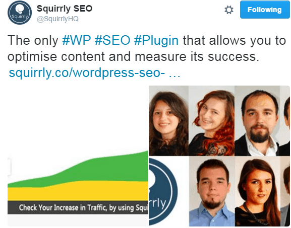
Social Media Links
You won’t get any clients right off of social media, but you can get leads.
Social media can bring in quite a bit of traffic. However, those people probably know next to nothing about your business. Your landing page may be the first impression they get.
A landing page stops being effective the moment you try to add an “about us” or “welcome newcomers” section.
Instead, focus on getting people to subscribe to your email list. Give them a reason to want to commit right away.
Here’s one of our tweets linking to a landing page for our WordPress SEO plugin:
Why Create Several Targeted Landing Pages
You need different approaches for various groups of people. We focused here on their familiarity with the company, but it goes deeper than that. If you offer different services, the audience is further segmented by the products they want.
There is no such thing as a “one size fits all” landing page. You’ll get the most leads by making dedicated landing pages for everyone.
It’s not as time-consuming as you may think. Start with a basic template and customize it for each group. With more landing pages, each with their specific links, it will also be easier to measure results.
Optimizing Your Landing Page for Humans
Now you know what a landing page should look like and the different kinds of people that will land on them. The question now is how the readers want to opt-in.
Well, there are many factors at play. Here are a few ways of raising your conversion rate:
Privacy Assurance
By this point, a lot of people expect to get spammed whenever they give out their email address. Some may refuse to subscribe even though they’re interested in your content.
Add a statement that you will never disclose their information. You could also mention how many emails you’ll send. This act alone can raise your click rate considerably.
ContentVerve did a bit of experimenting with this idea and their results are undeniable:
![[Source: ContentVerve]](http://squirrly.co/wp-content/uploads/2016/08/no-spam.png)
The Psychology Behind It
It can be hard for people to trust businesses these days. Most leads have had unpleasant experiences in the past, so they’ve become more cautious.
You won’t have this problem with loyal readers. The problem is that they’re a minority. Just by stating your intentions, you solve many trust issues.
Careful with the wording, though. Using the word “spam” will most likely bring your click rate down. Negative words tend to have negative results, just because you’re using them.
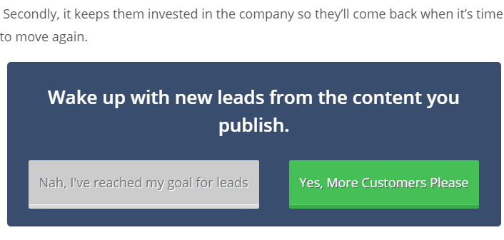
Limiting Choices
I already mentioned that it’s a bad idea to have multiple links on a landing page but let me show you how much of a bad idea it is.
Each link and button is an option. The more buttons there are, the less likely it is for the reader to pick one specifically. That’s bad news for you because you only want them to click on the call-to-action button.
Many companies have experimented with the links on their landing page, and all came to the same conclusion: less is more.
Here are Hubspot’s results:
![[Source: Hubspot]](http://squirrly.co/wp-content/uploads/2016/08/hubspot-results.png)
![[Source: Career Point College]](http://squirrly.co/wp-content/uploads/2016/08/CPC-results.png)
The Psychology Behind It
Plenty of studies have been conducted offline and online on the matter. The phenomenon affects lots of things, not just landing pages.
The idea is that, instead of making the wrong choice, people prefer to make no choice at all.
By adding more links, you give readers more options. They don’t know for sure which option is the best. Because of that, they end up doing nothing.
About Tooting Your Own Horn
Being humble is a virtue, but it’s not terribly helpful on a landing page. Show confidence and, even better, results to back it up.
If you’re offering software, talk about how clever it is. If you’ve got information, say how valuable and hard-to-get it is. Some may think that you’re just blowing hot air, but, at the end of the day, it brings results.
Take a look at Monetate’s landing page.
![[Credits: Monetate]](http://squirrly.co/wp-content/uploads/2016/08/monetate-smug.png)
The Psychology Behind It
After so much false advertising, people don’t trust everything a business says. Still, the bottom line is that a possible lead won’t believe in your company if you don’t do it yourself.
You don’t have to exaggerate the value you’re offering, but you shouldn’t sell yourself short either. Show the reader what you have to offer and let them decide what to do.
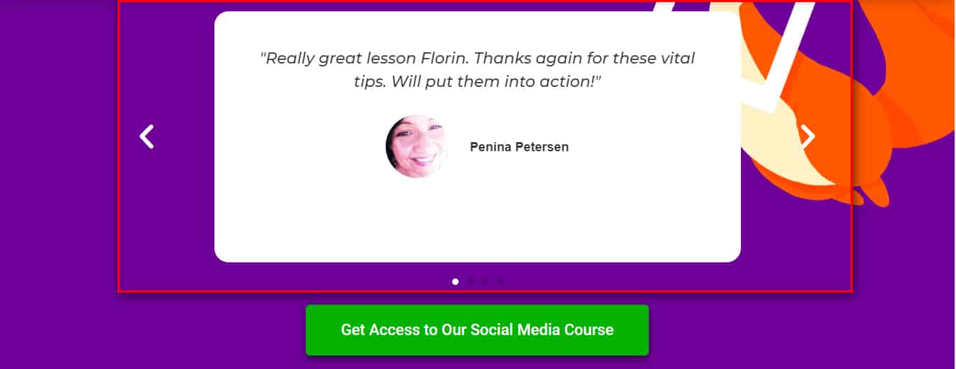
Presenting Happy Customers
Talking about benefits is good. Showing the results you brought to others, however, is even better. Present how you helped others in the past and you’ll gain a lot of trust and respect.
There are two different approaches here and both bring good results. You should use both if possible:
- Bringing up numbers. If you have 5,000 happy subscribers, talk about it. Ask the reader to join the bandwagon. If you’re getting lots of new leads every day, don’t forget to mention that too.
- Adding testimonials to your landing page. A quote from one of your happy clients will add a personal touch to the landing page. In many cases, this works better than plastering the page with large numbers.
Nothing brings authenticity to a landing page like a section about previous successes. It’s one of the best conversion elements at your disposal.
Here’s how we do it on our landing pages:
The Psychology Behind It
Going with numbers has a straightforward effect on the readers. They will think that if so many people agree that the stuff a company offers is so awesome, then it must be really valuable.
It’s human nature to try and be part of a group.
The testimonials, though, they hit a bit closer to home. The reader sees another person and the reaction they had to the newsletter or product. They consider that if other regular people like the offer, they might too.
Conclusion: The Cherry on Top of the Landing Page Cake
Now you should have a better understanding of landing pages and how they work. Even with all these tips, you’ll have to do some experimenting on your own. After all, audiences are different. What may work for us at Squirrly may not work for your business and vice-versa.
There is one thing that we still haven’t covered yet: the call-to-action (CTA). We mentioned it, but an excellent CTA takes as much planning and work as the rest of the landing page.
Don’t worry, we will give CTAs their well-deserved attention in the next lesson. See you then!