Grab a seat ’cause the next lesson is about to begin!
Last time, we got to talk about three conversion elements and how to use them. I hope you got the chance to try them out and see the results. If you remember, I also said that you need to do a lot of testing before you know for sure what works best.
This time around, we’ll be a bit more ambitious and aim for nine more conversion elements. Remember that our goal during this step in the lead generation process is to get an email address from our potential leads.
We have a lot to cover so let’s dive right in:
1. The Bottom of the Article
While not everyone sticks around to the end of articles, when someone does finish reading it, you can bet you have their attention. The logical thing to do is to put a proposition there, at the bottom of the page.
Whenever you ask someone for their email, you have to offer something in return. That’s the basis of most conversion elements. Since they’re at the bottom of your article, it probably means they liked your content. The best thing you can do is to offer them more content.
Focus on information. Offer readers valuable insight. For a person, information is valuable if:
- It’s useful to them.
- It’s difficult or impossible to find anywhere else.
- It’s easy to understand and apply.
Here are a couple of examples that will help you understand how it’s done:
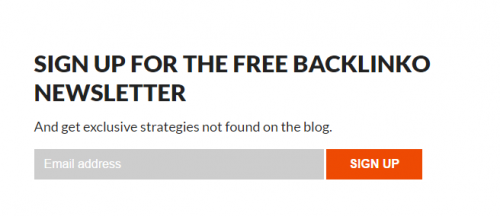
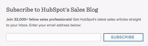
The trick with “bottom of article” messages is knowing what to offer. To that extent, Backlinko is offering a lot more exclusivity than HubSpot.
2. The Slideup Box
This nifty little box hangs around the corner of a site’s screen, offering visitors cool stuff. It’s not as invasive as a pop-up but it still grabs your attention.
This makes them almost as hard to miss as pop-ups but less annoying. You can also customize its timing to make sure you don’t put off readers.
You could make the box appear when people reach the middle of the page. If they click on the “X” instead of giving their address, make it so they won’t see it again for a month or so. This way, no one will complain.
This is what slideup boxes look like:

As you can see, the box can also be big enough to start covering content. Consider how big your box will be and run tests to find the optimum size. It has to be seen but it also has to be small enough not to annoy readers.
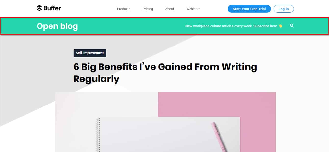
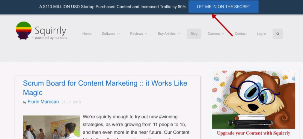
3. The Hellobar
No, it isn’t a pub where you meet new people.
The hellobar, a lot like the slideup box, is a line that lingers at the top of your blog posts. You get to choose what color, copy(written text) and links it has.
Since you can’t fit a big call to action into a tiny bar, you have to get straight to the point. Try to get people interested with as few words as possible. It’ll take you a bit of practice, but you’ll get there.
Another cool thing about the hellobar is how convenient it is.
There are some cases in which readers want to give their email address right away, but don’t see any immediate way of doing so. They’ll most likely see the hellobar then. Maybe it didn’t convince the person to subscribe, but it got the address.
If you’re not using many conversion elements, add a hellobar. Don’t lose a lead because they couldn’t find the “subscribe” button.
In the past, we used a hellobar ourselves together with a slideup box and got some pretty good results.
Here’s what your hellobar could look like:
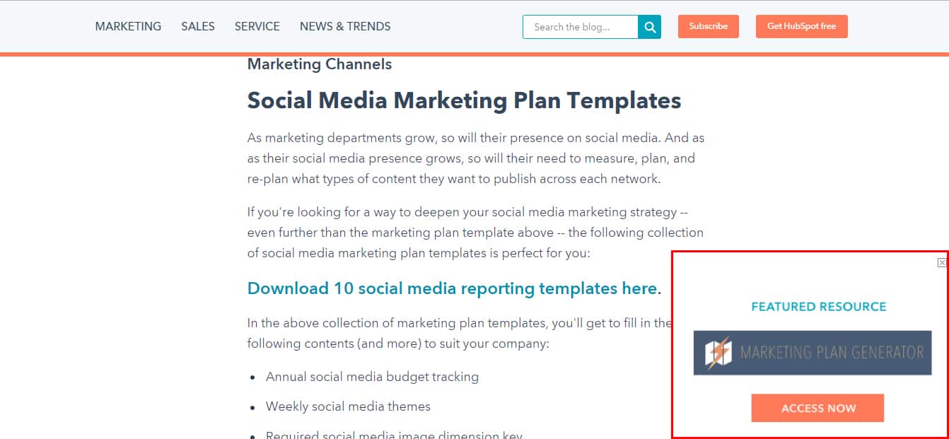
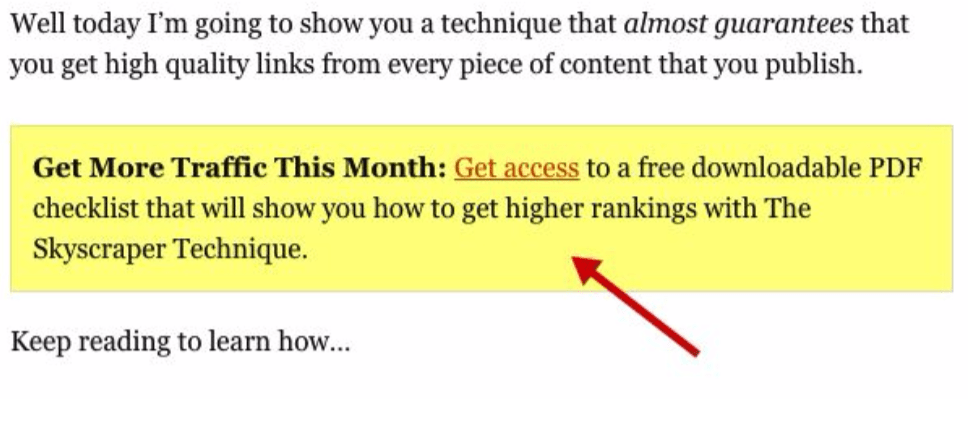
4. Content Upgrade Pop-Ups
I can already hear you say “Florin, we already talked about pop-ups!” Yeah, we did, but these are a special kind of pop-up. In fact, they have more in common with bottom of article conversion elements than with pop-ups.
The fundamental principle behind content upgrades is easy to get:
- You create top-quality content.
- At some point in the article, you offer extra resources related to the content, asking for an email address in return.
- People take you up on the offer because the content is worth it.
One of the hardest parts about using upgrade pop-ups is choosing when it’s worth it. Creating extra resources takes time and effort. As a result, it may not be worth the effort every time.
Before committing to this tactic, do a bit of experimenting first. Take one of your best articles and do the content upgrade trick. See how well it goes.
Here is an example of the upgrade pop-up done by one of the pioneers of the tactic, Brian Dean:
Clicking on “get access” leads you to this:
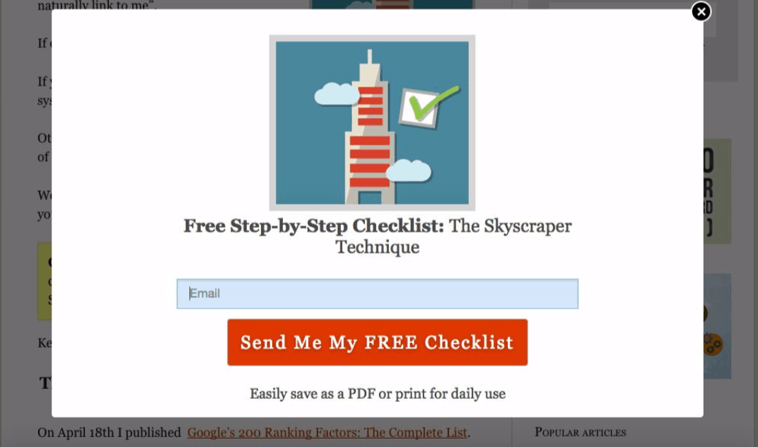
The readers already know how good the content is, want more, so they give you their email addresses.
5. Redesign Your Homepage
Your homepage has the potential to bring in the most leads. It’s often the first and only page viewers get to see. That’s why it’s crucial that your homepage is optimized for lead generation.
Redesigning your homepage is often a hit-or-miss situation. If you start doing it, make sure you have the time to redo it a couple of times based on the data you receive as feedback.
There is no “perfect homepage”. There are a lot of factors at play. The best you can do is try to understand your audience. Personalize the website according to their wants and needs.
You don’t have to start from scratch. Look at your homepage and ask yourself “Which of these things should visitors see?”. We are focusing on email addresses so the answer is “the opt-ins”.
Put all your conversion elements in such a way that people can see them right away. Blog posts, “about” pages and so on can take the backseat.
Noah Kagan’s website in an excellent example of a successful makeover:
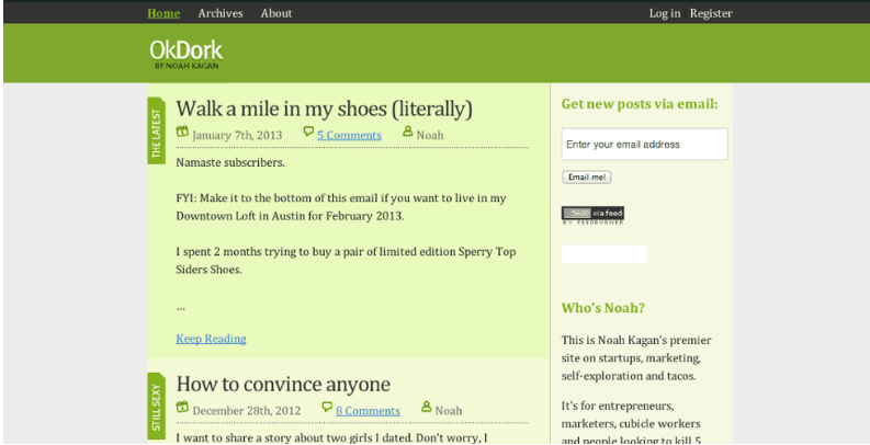

You can browse the website without giving your email address, but it’s much more compelling to do so now.
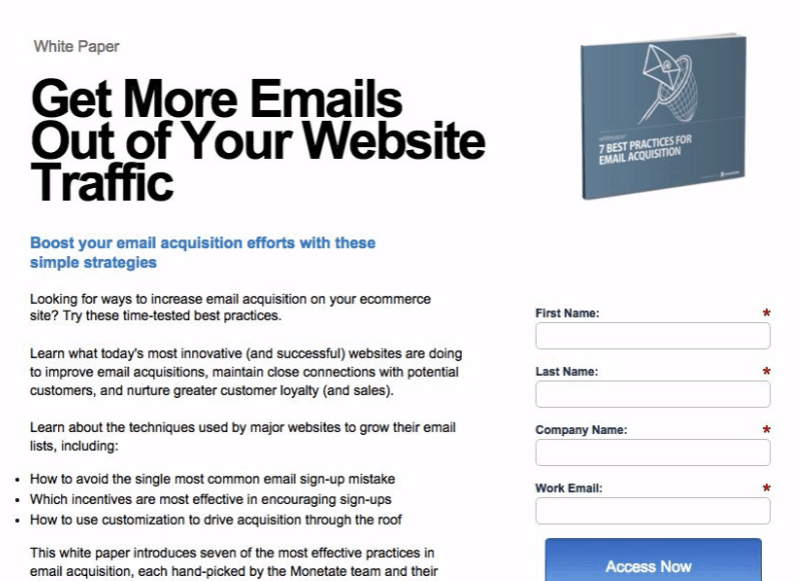
6. Dedicated Landing Pages
Landing pages are crucial parts of the lead generating machine. Most businesses understand this and make landing pages. Still, it’s one of the most poorly used conversion elements.
A whole lot of thinking and planning needs to go into each page, but we’ll get into that in our next lesson.
The first thing you need to know about dedicated landing pages is that, as the name implies, they’re dedicated to one subject, one purpose. If you offer several services or products, don’t just dump them together in one single page.
Landing pages have to be very targeted. The advantage of dedicated landing pages is that you can offer guests exactly what they want from you.
Software developers can offer product trials. E-commerce websites might give discounts. Marketing agencies leverage valuable information. Those aren’t always the case, of course, but you get the idea: different industries have different requirements.
Avoid being vague on your landing pages. Each extra detail you offer proves how well you know your audience. Just look at this page.
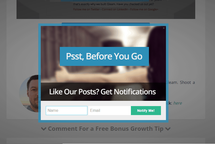
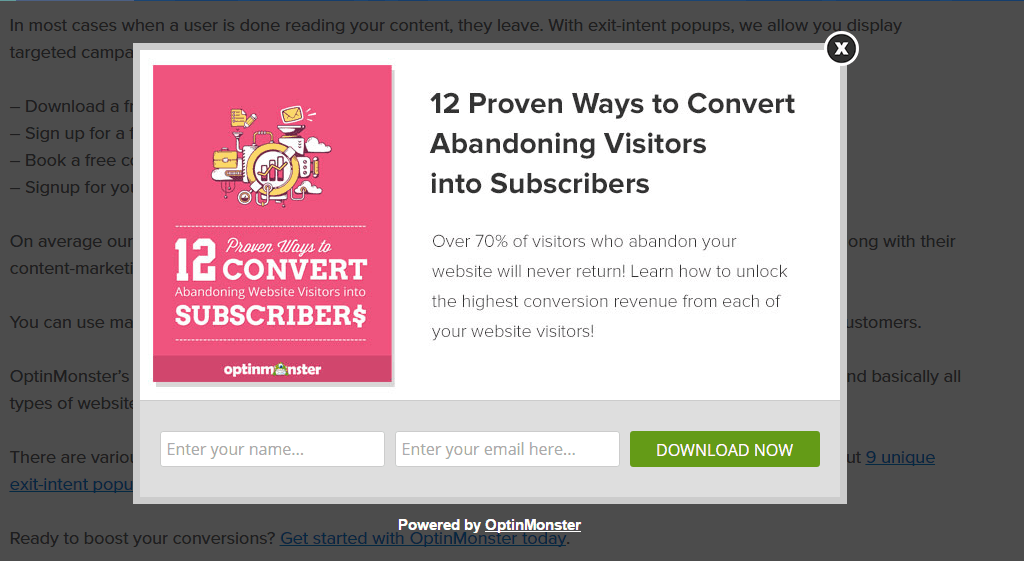
7. Exit Intent Pop-up
Great, another pop-up, am I right? Well, that’s just the reality of things: pop-ups are useful. These ones, in particular, get excellent results for eCommerce businesses.
The name kind of gives it away. It’s a pop-up that only pops up when you want to leave the website. When this happens, you’ve got to hit the viewer with the best offer you’ve got. It may be your last chance to gain them as a lead.
For the eCommerce industry, it’s easy to attract users to click on it, because there’s the option to offer a discount to the products people were about to leave in the shopping cart. For other companies, however, it may not have much of an effect.
A good question(maybe even the best question) is what should you include in exit-intent pop-ups. Here are some ideas you can use:
- Discounts. I kind of spoiled this one, didn’t I?
- Contests. People are more willing to give their email addresses if it means they may win something cool.
- Targeted messages. If you know something about a visitor( like how they came to your website), you can leverage that to keep the browsing. Using clever copy that shows you’ve researched your target audience will help pique visitors’ interest and prove that you have something valuable to offer.
- Loyalty Gifts. Everyone likes to be treated well, to feel appreciated. You can give recurring visitors more than just value. You can offer them a token of appreciation for their loyalty.
As you can see, there are many ways you can use exit-intent pop-ups. Experiment a bit and see what works for you. Here are a few examples of what your pop-ups could look like:
Worried that people might find your pop-ups annoying? Well, think about it this way: If people complain about your pop-ups, they probably would have never become clients anyway.
Essentially, you don’t lose anything. So they are definitely worth giving a try.
8. Top Nav / Sidebar / Footer Links to Landing Pages
As content creators, we know that you can’t just ask a stranger to buy products or services. We need to gain their trust first, and rushing the process is generally a bad idea. That doesn’t mean that you shouldn’t offer visitors the chance to become clients as fast as possible.
We already talked about what a landing page should contain. Now let’s focus on where to put links to them.
Design your website in such a way that the reader can always access a landing page. Watch out, though! You don’t want to be too pushy.
The top nav, sidebar, and footer are the best spots to put these links.
Here’s an example of what readers see if they read an article on your website:
- They enter the website and see an interesting link in the top nav. They don’t click it because they don’t trust you yet.
- They’re reading the article, enjoying it and they see another cool offer in the sidebar. They’re tempted, but they want to hear everything you have to say.
- They finish the article and like it. In the footer, they see the offer for the third time and decide that it’s worth checking out.
After that, it’s the landing page’s job to convert. The example I gave isn’t extremely realistic because people don’t usually trust a business after only one article. The process is the same, though, it’s just on fast-forward.
If you look to the right side of the screen, you’ll see our sidebar and the links on it. Here’s an example of top nav links from another website:
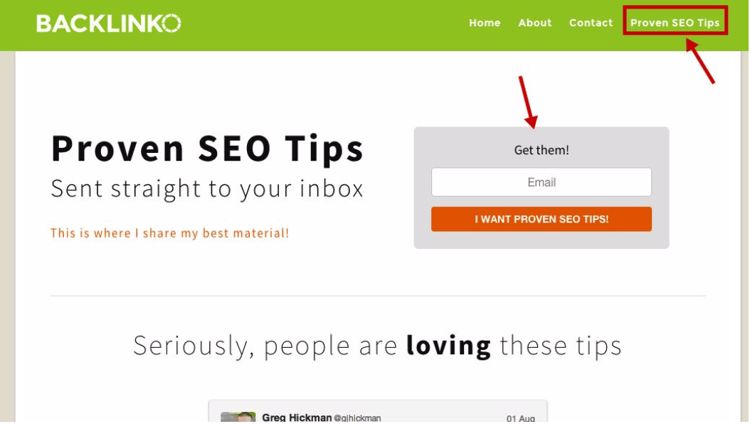
The more conveniently placed your links are, the better conversion elements they become.
9. Within Individual Articles
Why should the corners of your blog get all the love?
The posts themselves should have links of their own as well. You get to choose where exactly they’ll be, meaning that you can add a link wherever you see fit. Besides anchor text links, you can also add conversion elements within your articles.
For instance, you can add Buttons which contains links, but unlike regular links, they are harder to miss because they stand out quite a lot.
Use them strategically to break up large blocks of text to make the article more readable. Don’t overuse these or else your posts will look spammy.
The most important place where you should put a link is at the end of the article. Make a compelling call-to-action and add the link to it. If you only put one link in the whole post, it should usually be at the end.
An example of an anchor text link is this ” check out our WordPress plugin for SEO“. Buttons look more like this:

The results these links bring mostly depend on how good your content is and where you decided to put them.
Conclusion: Why You Should Use these Conversion Elements
Social media marketing and blog posts are great. There’s no denying that. However, those methods aren’t the least bit personal. You don’t read every article that you see on Facebook, do you?
Emails are much more likely to be read and engaged with, which is why it’s so important to build your email list. Once you have that, you can send content and offers directly to your readers. If you want real engagement and lead nurturing, this is the way to go.
Using conversion elements like the ones I talked about in this article will help you grow your email list, which is a crucial step in growing your client list.
That wraps it up for this lesson. In the next one, we’ll take an in-depth look at landing pages.
See you next time!